Posted on Leave a comment

Showcase Your Branding in Photography: Use a Gradient Map for a Duotone Effect

We get a lot of requests for colorization work on customers’ images, so we like to keep tabs on photography techniques both old and new. Way back in 2015 we blogged about converting images to black and white, and how to use a gradient map to achieve a rich effect. For the purposes of that conversation we were using it to maximize just two colors, but you can use more than two.

We like the idea of using branding to customize a great—or even not-so-great—piece of photography. If your business has only two branding colors, that’s fine, you can add white and/or black to get some depth in your image. Having said that, there are a lot of really cool duotones out there. So if your two corporate colors are of high contrast, rock and roll! It’ll be that much easier to get a stunning image with minimal effort.

Just as a technical consideration, the artwork you’ll end up should be suitable for either web or print. However, it’s good practice to check with the folks who will be producing your piece before going through the trouble of colorizing an image. They may have some advice on how to set up your color space. And of course, it’s a good idea to work on a copy of your photo in case it doesn’t come out the way you want and you wish to start over.

The Humble Beginnings…

Logo with three colors, four if you count white.
As is, this image lacks that “Wow!” factor.

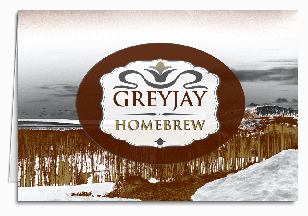
The logo for this home-brew supplier doesn’t complement this unremarkable photo of Yellowstone Park at all. The challenge is how to integrate them into a unique piece of art. With a little effort and some experimentation, we should end up with handsome corporate note cards, or a design for a Christmas card they can send to their friends, customers, and business associates.

You’ll want to find out what colors you’re dealing with, so consult your corporate branding guidelines and look for the Pantone Matching Systems (PMS) numbers or CMYK formulas. In this case, we have a brick red, a charcoal grey, and a gold. They don’t really have PMS designations, but that’s okay. We could make them spot colors and name them GJ Red, GJ Grey, etc. if we needed to, depending on how it’ll be produced.

The Magic

The artist created a gradient map layer (on the right, highlighted in blue in the layers panel), and plugged in the three colors plus white. She moved the sliders around in the gradient editor (box on the left with all the colors in it), to experiment with the positioning and relationships between the individual hues. You can slide those little “stops” right past each other and see the colors in the image shifting in real time. The magic is in how the shades blend into each other. In one case she tried just the grey and the gold with white, and while the result is pretty, it didn’t fit the bill. Incidentally, you can save each iteration as a “new document” in the history pane, then move on to the next.

This looks a little too apocalyptic for our purposes.
That much “gold” snow is just off-putting, though the sky is pretty.
This has a nice drama to it.
Attractive, but feels more Southwestern than Northwestern.

The Prestige

It bears noting that the result is actually a tri-tone, but is usually referred to as duotone. Whether you have your in-house graphic team work on it, or send us your photo and logo, the possibilities are exciting—such a compact and elegant form of business communication.

Posted on 1 Comment

Design Tip: Converting to Black and White in Photoshop

I love discovering new design tools and techniques. And sometimes, when I do, I like to share them. For a while, I thought there were only two or three ways to convert to black and white, and that one of those ways was pretty much, everyone agreed, totally lame. Turns out, there’s at least eight. Here are four.

For the purpose of these tips, I’m assuming you’re an intuitive beginner at Photoshop and have already sorted out the layers panel. I’m also guessing you have a fairly recent version—CS3 or better.

Black and White adjustment layer i n Photoshop
I got the side-by-side effect by deleting a selection from the adjustment layer.

My favorite method is the Black and White adjustment. Add a B&W adjustment layer (either from the layer menu up top, or the row of icons at the bottom of the layers panel [the half moon]) above your color image, and start setting those six sliders where you want them. You have tons of control here, you can get some nice effects. But beware, you can also get some weird, blown-out details, and graininess. The red and blue on this plane’s wing were of particular focus for me as I made my adjustments.

This photo was taken at the Evergreen Aviation Museum in McMinnville, Oregon
This photo was taken at the Evergreen Aviation Museum in McMinnville, Oregon.

I’ve also used the Channel Mixer, though you don’t have quite as much control over the tones—there’s only three sliders. Again, it’s a new adjustment layer, and when the box comes up, you’ll tick the ‘monochrome’ check box, and make sure your three values are always adding up to 100% as you fiddle with the sliders. This will do in a pinch, especially if you just don’t have time to make fine adjustments.

Gradient Map in Photoshop
Gradient maps are useful for more than just black and white.

The Gradient Map is fun to work with, and can be used with any two colors, not just black and white. In the image of the bi-plane, it’s slightly sepia-toned. And, of course, you’ll find it in the usual place, as an adjustment layer. When the box pops open, you can find additional gradients by clicking on the small down arrow at the right end of the sample of the current gradient, then clicking on the gear icon and choosing from the alphabetical list at the bottom.

Black and white adjustments in Photoshop
Trying out different tonalities with dual Hue/Sat adjustments.

Another common technique is the Hue/Saturation adjustment, but here’s the cool part—instead of one adjustment layer, you’ll use two, since a single layer wouldn’t be much more exciting than simply converting the file’s color mode to greyscale. Get the two layers in there in the usual way, name them if you want to. Your topmost Hue/Sat layer is simply adjusted so the saturation is -100 (all the way to the left). The layer under that, the one that’s right above the image, has one special element to it—the layer’s blending mode is set to ‘color.’ The blending mode selector, in case you haven’t worked with that yet, is above your list of layers right next to the opacity selector. Its default is ‘normal.’ Once you’ve set that, you can move the Hue slider on that middle layer around and experiment with the tonality. You can adjust the saturation and lightness, too, but the magic is in the hue adjustment.

The good thing about all four of these methods is that the adjustments are all completely tweak-able until you flatten or save for web. Of course you’ll always exercise due diligence and talk to the folks who will be printing the piece to find out what kind of files they need. Any design is only as good as how well it prints. The good news is, they’re just as committed to the quality of the printed piece as you are, and will mostly be quite helpful.

Try some of these techniques on your next design project – perhaps a gorgeous custom corporate holiday card design that we can turn into a beautiful printed piece for you here at Cardphile (complete with envelopes so all you have to worry about is the design!)

Have questions about this or any of our other designs tips? Post them here and we’ll do our best to answer them for you.

Posted on Leave a comment

Design Tip: Avoiding Glare on Eyeglasses in Group Photos

We often print staff photos in our customized business holiday cards, and it’s not uncommon to end up with glare on the lenses of subjects’ eyewear. It may not seem like a big deal, but at the very least, it can make a great picture not so great, and at worst can make the person appear… otherworldly, for lack of a better term. In a large portrait of just one or two people, it’s easier to control the lighting, and to edit any anomalies. With a smaller group photo, one person with blanked-out eyes can ruin the picture—and editing efforts can make it worse. Imagine your eight-person office staff in matching Santa hats in a fun snapshot, but with Regional Manager Ed’s eyes hidden behind an eerie pale glow. His clients will never trust him again! Okay, maybe it’s not that dire, but it is distracting, and perfectly preventable.

Lighting is the first and most obvious preventative measure. Assuming you don’t want to hire a professional photographer, (and honestly, you probably don’t have to) you can capture your image in an area with non-harsh lighting coming from multiple angles. Ideally you can use a blend of natural and indoor light sources. You may also be able to employ some semi-opaque plastic sheeting to diffuse light; and have a ‘spotter’ directing your very patient subjects. This is obviously the non-spontaneous way to capture your image, and can yield fantastic results, depending on circumstances.

If you don’t need your subjects to look posed, you can try out the rapid fire setting on your camera, like those fancy fashion photogs in the movies. Take twenty or so shots in succession as they’re belting out a holiday song or adjusting their Santa hats and giggling at each other—something like that. Tell them a knock-knock joke, or give them alcohol if you have to. Or both.

Back to seriousness, an oft-used technique for ensuring glare-free lenses, one that is appreciated by design departments far and wide, is two back-to-back shots—one of the bespectacled folks with glasses on, and one with them off. If you have a composition, props, and lighting conditions that you really like, this is a good way to ensure your custom photo holiday cards will look their best. Send both images in with your order, and we’ll have the extra shot as a back-up for any editing needs. Of course, you could get lucky and get a perfect pic the first time. But if you’re like the rest of us, and/or if you have trouble getting a dozen near-sighted engineers to sit still, it’s probably a good idea to take that extra step.

In case none of the above work out for you, our design department has some pretty cool tricks. More likely than not, we can make it work. It’s what we do.

Designer Tips for fixing reflections from eyeglasses in photoshop
Don’t let one bad reflection spoil your image!