Architecture Christmas Cards Winter Corinthian 4140
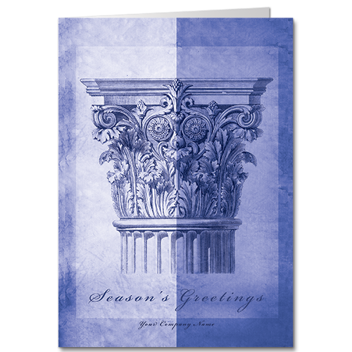
A classic beauty, this detailed sketch of a corinthian capital is rendered in gorgeous, medium-contrast blue tone. These ornate carvings are so eye-pleasing, they come up here and there in our collection. The gold-toned version has been one of our more popular selections for years, particularly as a calendar. Either way, when you design your architecture Christmas cards with us, you’re sending a unique greeting that’s sure to make a memorable impression.
Color-Theory Corner: Blue Denotes Dependability, Quality
Our work doesn’t just happen accidentally. We’ve been designing Christmas cards for architecture firms like yours for over 3 decades. If you’re moved by the blue tones, we have more where that came from. This new design pays tribute to the very steel and technology used to erect our modern buildings. This deep, blue beauty brings the humble blueprint into the holiday season of joy. And if you prefer a little playfulness cunningly blended with a vintage music reference, this one may fit the bill.
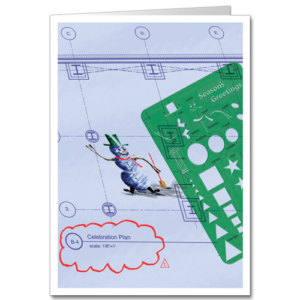
Consider a Green Architecture Christmas Card
Whether you’re committed to sustainable business practices, or you just like the classic Christmas colors of red and/or green, we’ve got you covered. As you click through our gallery, remember, virtually all of our cards are fully customizable. If you’d like to check out your options, just click on the ‘Design online’ button, and you can noodle around in our online editor. You can customize the front of the card, the inside verse, the blank left panel, and your envelopes.
Not jazzed about the card you’re working on? Click out and try a different one. Still not seeing what you want? Try a calendar card—they mail with first-class postage and keep your contact info front and center all year long. And if you have ideas we haven’t thought of, contact our holiday consultants. We love to collaborate!

It’s easy to order!
Enter coupon code WEB26X at checkout for an additional 35% off the price displayed below during our Pre Season Sale!
Discount per quantity
| Quantity | Price | % Discount |
|---|---|---|
| 1 - 49 | Price range: $4.930000 through $6.080000 | - |
| 50 - 74 | Price range: $2.992510 through $3.690560 | 39.30% |
| 75 - 99 | Price range: $2.834750 through $3.496000 | 42.50% |
| 100 - 124 | Price range: $2.766716 through $3.412096 | 43.88% |
| 125 - 149 | Price range: $2.595645 through $3.201120 | 47.35% |
| 150 - 174 | Price range: $2.456619 through $3.029664 | 50.17% |
| 175 - 199 | Price range: $2.456619 through $3.029664 | 50.17% |
| 200 - 249 | Price range: $2.339285 through $2.884960 | 52.55% |
| 250 - 299 | Price range: $2.253503 through $2.779168 | 54.29% |
| 300 - 349 | Price range: $2.150466 through $2.652096 | 56.38% |
| 350 - 399 | Price range: $2.077009 through $2.561504 | 57.87% |
| 400 - 449 | Price range: $1.999608 through $2.466048 | 59.44% |
| 450 - 499 | Price range: $1.936997 through $2.388832 | 60.71% |
| 500 - 549 | Price range: $1.873893 through $2.311008 | 61.99% |
| 550 - 599 | Price range: $1.861568 through $2.295808 | 62.24% |
| 600 - 649 | Price range: $1.861568 through $2.295808 | 62.24% |
| 650 - 699 | Price range: $1.835932 through $2.264192 | 62.76% |
| 700 - 749 | Price range: $1.823607 through $2.248992 | 63.01% |
| 750 - 799 | Price range: $1.760503 through $2.171168 | 64.29% |
| 800 - 849 | Price range: $1.748178 through $2.155968 | 64.54% |
| 850 - 899 | Price range: $1.698385 through $2.094560 | 65.55% |
| 900 - 949 | Price range: $1.659931 through $2.047136 | 66.33% |
| 950 - 999 | Price range: $1.659931 through $2.047136 | 66.33% |
| 1000 - 1249 | Price range: $1.609645 through $1.985120 | 67.35% |
| 1250 - 1499 | Price range: $1.609645 through $1.985120 | 67.35% |
| 1500 - 1999 | Price range: $1.446462 through $1.783872 | 70.66% |
| 2000 - 4999 | Price range: $1.358215 through $1.675040 | 72.45% |
| 5000 - 9999 | Price range: $1.320747 through $1.628832 | 73.21% |
| 10000+ | Price range: $1.307929 through $1.613024 | 73.47% |
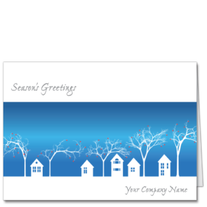
A Classic Corinthian Column Features Prominently in These Architecture Christmas Cards. This Historical Design Could Also be a Perfect Image for Your Law Christmas Cards and Features Your Company Name on the Front ~
Helpful Info:
| View and download a PDF proof and add your final design to your cart from the design editor. |
| Options such as adding a logo or signatures to your card or upgrading envelopes will be available from your cart. |
| Questions? Call 1-800-774-5857 |
| Weight | 0.07 lbs |
|---|---|
| Dimensions | 7.25 × 5.25 × 0.048 in |
| Card Stock | Satin (AEC), Uncoated (SMO), Pearlescent (SGP), Silver Metallic (SGS), WaterColor Texture (ART) |

Satin: This is our 110#, matte finish, bright white card stock. We give it a special satin coating on the card front to further enhance and sharpen the image. Since the inside of this card stock is not coated, it is suitable for hand-signing your greetings if you wish.
Uncoated: Uncoated card stock is not shiny, but rather has a beautifully soft finish, like writing paper, on both sides. This nice heavy card stock is 100# bright white, and a beautiful complement to many of our designs.
WaterColor Texture: Bright white, thick, and with a rich water-colory texture, this very special paper begs to be handled. This is perfect card stock for many of our designs, and super easy to hand sign. It has a beautiful, uncoated (not shiny) textured finish – also perfect for our corporate logo notecards!
Pearlescent: Ooh…everything just glows on this beautiful, pearlescent, 105# greeting card stock! It makes any design look special, but those with a wide range of colors, blends, and gradients are particularly outstanding.
Silver Metallic: Like the Pearlescent, this silver metallic card stock sets your greeting apart. It actually is a silver color throughout the paper (both inside and out) and colors are deepened when printed on this beautiful, luxe card stock.

Reviews